Colour palettes
Creating a colour palette for a home that is specific to your house, landscape and family, rather than copying trends requires a fresh look at the colours in your everyday. Inspiration can be sourced from landscape and local environments that either calm or invigorate, from popular culture, artwork, or from places that mean something to you and your family. Stepping away from the colourcharts, samples, and showroom displays enables you to start with an original concept for your home that then informs choosing materials and finishes so that they feel cohesive as you journey through the different rooms.
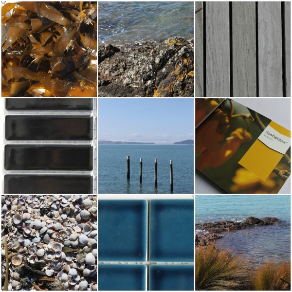
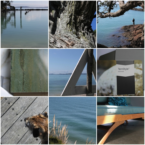
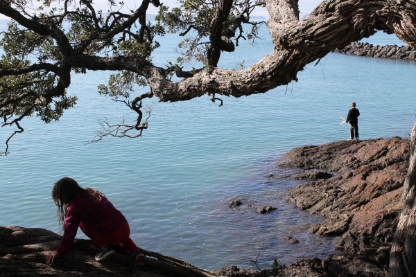
A walk along the beach in our family means many things for each of us - for Scott it's about getting some exercise, for me its a chance to get fresh air and take photos, for the kids it's a chance to scooter, climb trees, or find LARGE sticks to bring home, and molly loves meeting and greeting other dogs .... suffice to say we don't make fast progress! It's a special place where the colours calm and refresh, the materials and textures are authentic and beautiful - pure design inspiration for our family!
Now, I'm not saying that these colours and materials are going to be everyones cup of tea, however when you think about collating colours, local experiences, art, textures or patterns that mean something to your family or your specific house location which images would you bring together? Taking these as a springboard, then you may begin to see common threads and themes that will help you develop a palette. The next step is gathering samples, fabrics, colours and textures that stay true to this idea then testing them out in your unique light and location.
Don't forget about texture, this has a dramatic effect on colour, and also enriches your experience of a space. The word ‘aesthetics’ comes from the Greek ‘aesthetikos’ meaning ‘a sense of perception’. Our visual sense is affected by cultural definitions of ‘beauty’, light and sunshine (which has a different 'look' in different parts of the world). Our haptic sense is our sense of touch, not just with the hands but experiencing/sensing the world physically and feeling pressure, warmth, cold, pain, and kinesthetics. Simply put, it relates to how we feel that we FIT in a space as well how TACTILE surfaces can have an effect on the way we move through spaces. Rough textures can help us to slow down (imagine walking past a rough wall, we generally tend to be more cautious), smoother ones speed us up. This can be used to advantage in 'retreat' spaces designed for relaxing.
Combining these ideas with your different colour associations creates a rich language to explore and play with in your home materials and spaces. I hope you have fun with your colour palettes!
Share