White
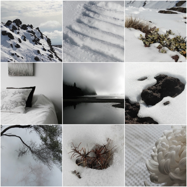
The snow flurries this week have inspired a collection of winter white images for our moodboards. If you have ever had to choose white paint for a room before you will know the huge degree of variation that is possible on the colour charts, from warm whites to cool tones that will influence the feel of a space. The perfect white for your home will be one that responds to the light conditions and orientation of the room and the materials that you wish to pair it with. The impression of white walls differs with quality of light they reflect, is dependant on where you are located in the world, and also the context/outlook it is viewed in, and the feel you want to create eg. is the light filtered through trees or is it an East or West facing room which will appear to change colour at different times of day with the light from the rising or setting sun.
We use Cool whites a lot in our contemporary spaces, because many of the rooms we create are designed to catch northern light, and it enables the volumes to feel crisp and fresh. Our colour reference may be freshly fallen snow against black rocks. It works well against contemporary metal, concrete and dark timbers, and often may have a blue or green tint within it, so naturally will work well with those colours. Blue whites work well in East facing spaces that you use in the morning with fresh morning light.
Warm whites are used a little more where there are existing rooms that do not get as much light and/or the materials or furnishings that will be used within them are natural timbers or have a little more cream in them (pink, red, yellow base). For this we may refer to fresh flowers and natural linen, still clean in tone but with a softer chalkier edge to it. These tones layer well so if you have have several off-white and neutral shades in your furnishings you can choose a range of warm whites that are complimentary to each other. Use slightly pink whites to offset 'greenish' light that is filtered through trees and make the space appear 'whiter'.
Grey whites remind one of misty mornings and foggy days, need to be used carefully with other materials in the room so they do not appear too sombre in evening or artificial light. They work well with a carefully considered colour palette of layered greys, blacks, dusky colours, and are good paired with a few glossy/metallic details and weathered timbers where light, shadow and reflection are emphasised over the day. They can work well in west facing spaces that you use in the afternoon which recieve warm low light or bright north facing rooms if you wish to soften the light a little.
When trying out your samples keep it simple with a selection of three A4/A3 colour samples on card spaced well apart on the wall (that are either in the cool, warm or grey palette depending on the other materials in your space) and consider the effect of the light on them over the course of a couple of days - both in natural and artificial light. Move them around, and look at them against the other materials for floors/drapes etc in the orientation they will be within this space (eg. horizontal for the carpet/flooring sample, vertical for the drapes) - as this will impact on how they appear against each other. Also remember that if the room you are viewing them in is highly coloured this will affect the impression of the colour chips, so check them out in an adjacent room with the same orientation. Hopefully this should help narrow down your selections and make the decisions a little easier!
Share